The Challenge
After conducting internal research, I identified that our sales team spent a significant amount of time answering emails from potential clients. However, a lot of those questions were answered with basic information, which could have been answered on an informative website, and this time could be used to convert a more qualified lead. Therefore, we prioritized the website redesign with a major goal:
- Reduce the wasted time of our sales team answering basic information;
- Increase the number of direct bookings without compromising bookings from agencies.
Discovery
English schools for foreign language learners have two main stakeholders: students and travel agencies. However, the first ones are our direct clients, they decide which school they will study at.
Therefore, the goal of my research was to uncover the main reasons the students take into consideration to choose a school and which aspects they are looking for.
Market analysis
Malta attracts a lot of foreign students from the whole globe, as the government investment in the “English as a foreign language” industry increased in the last years. A report is released yearly with data from all Maltese schools, where it’s possible to check how many students came to Malta to study English in the past year, as their nationalities, gender, and so on.
The majority number of students, who leave their countries to study abroad, made their bookings through agencies
This report helped me to understand the big picture of the market around the country, comparing ACE English Malta with other competitors, also opportunities to pursue or new markets to discover.

Surveys
Every week, dozens of new students arrive from and depart to different countries and age groups. The school shares with its students a survey at the end of their course to understand their point of view. I reformulated some of the questions trying to understand not only how their experience was, but how everything started.
The survey answers exposed an interesting fact: for both types of students — direct bookings and booking from agencies — our website was a point of contact in their decision process.

Interviews
The surveys worked as my quantitative tool, then I had to go for a qualitative one. So, I decided to run some in-depth interviews. Thus, I’ve created a script for a semi-structured interview which would help me during the interview sessions.
Based on the previous analysis of the Maltese market and the historic data of the school, 10 students have been invited to participate. I tried to create a diverse pool of students, the general criteria to select them were:
- 5 biggest nationalities at ACE English Malta history;
- Market not well explored by the school with huge potential.
I also had to invite some school staff to translate if the students didn’t understand any of the questions, I diversified the participants by inviting individuals of different genders, ages, and English proficiencies. During the interviews, I could identify and validate some of the findings previously discovered.
After the interviews, I could point out several factors which people may consider to choose a school: price, country, location, technological techniques in the classroom, etc.
Competitors
Working alongside the Marketing Manager and the General Manager we reviewed ACE’s strategy and which public they considered the school target. With that strategy in mind, we’ve created a list of schools that we considered our direct competitors.
I analyzed several aspects of their way to communicate and the channels, website, Instagram, or Facebook. The aspects I primarily focused on were: type of content, tone of voice, etc.
Customer journey map
Then, I’ve created two Customer Journey Maps — one for each type of student — trying to map and identify the pain-points and feelings of their experience across different touch points when choosing a school.
Also, the website content was not clear, easy to understand, and didn‘t even have content for some topics.

Designing
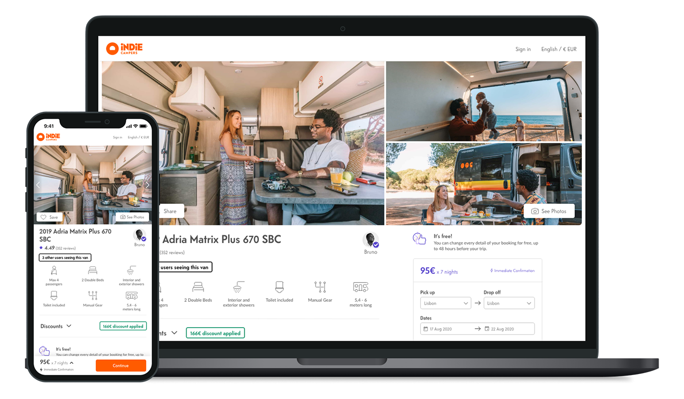
A good design is more than just aesthetics. ACE English Malta is one of many English schools in the country, our website visitors are looking for schools, so they are accessing another website at the same time.
Our new website should be easy to navigate and the content should be easy to find and to read.
Information architecture
Nowadays, English is a language a lot of people want to learn. ACE English Malta has several courses, one for each type of learner, from age to methodology. One of the biggest challenges at this stage was: How to show all those courses understandably?
I’ve run some card sorting sessions with different groups of students. My goal was to find how they would group and categorize all the courses the school offers. Also, to have a wider perspective, I’ve invited the school staff and the management to participate in other different sessions.

Sketch and Prototype
Before starting any sketches, I needed to determine where we would create the website. As I wouldn’t have any developer working with me, we decided to use WordPress. Thus, I started to analyze which kind of components I could use to create the prototypes, and in the future, the website.
I’ve decided to create two kinds of prototypes: a low-fidelity prototype or paper prototype; and a high-fidelity one. The goal of the first was to understand the better user flow; the second to test the interface itself and check with chosen elements work on the interface.

Copyright and SEO
Another huge factor we had to think about was the copyright. Because it directly influences how users understand the school, services provided, and important information they need to consider. We’ve created, together with one of our teachers, guidelines on how the website copy should be written and the tone of voice — not so formal, considering our main target, but not so informal.
In a market full of competitors, impacting SEO ranking is mandatory to get noticed
In these guidelines, each page should have a copy explaining the topic, but also based on keywords focused on SEO. Working directly with one of our teachers was a great idea because he could bring and combine his outstanding English language expertise with his knowledge about the school and the students.
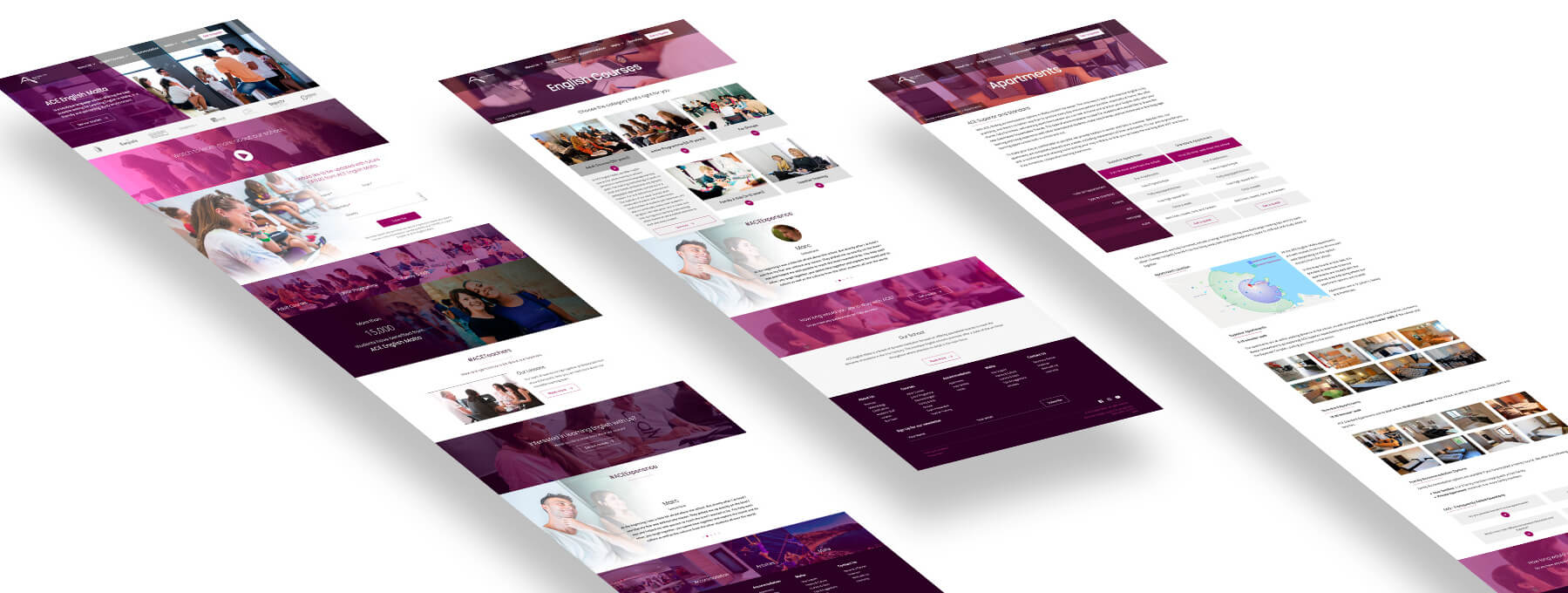
Development
As mentioned previously, I’ve built the website using WordPress, due to my previous experience with the tool. My expertise with HTML and CSS supported me so I could build and customize the website as needed.

Results
The entire process took around 3 months and a half, considering the research to the release. In the beginning, we identified on Google Analytics a huge increase in website access, which gave us a good first impression. After 5 months, I compared the metrics of the new version with those from 5 months prior (the old version):
- New users: increased by 20%;
- New sessions: increased by 30%;
- 36% more visualization on the pages;
- Users spent 8% more time;
- “Get a quote” page access: increased 150+%;
- 28% more direct bookings
Drag and slide the green circle to compare versions
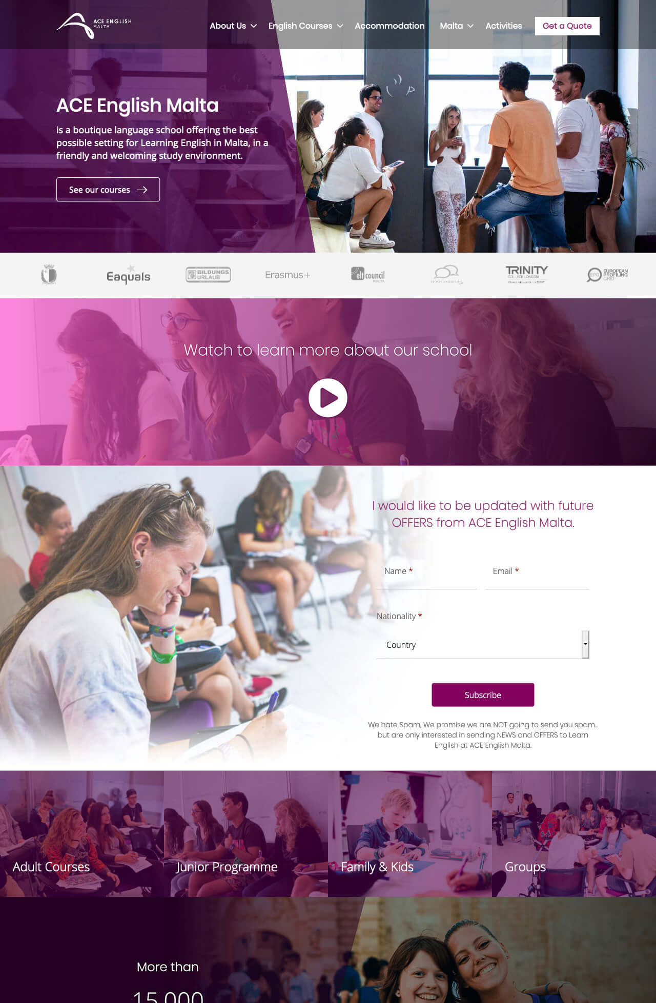
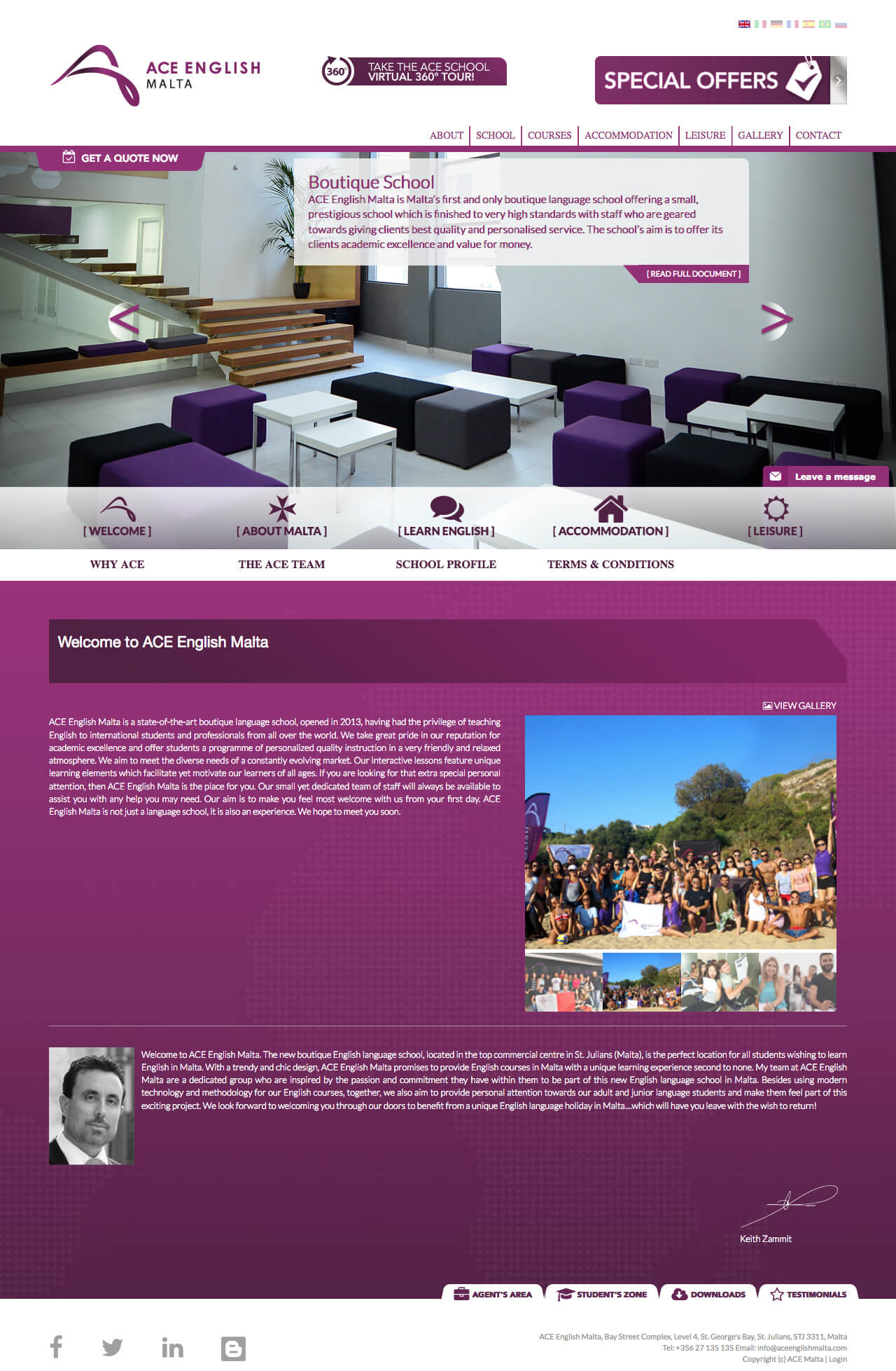
Comparison between the old and new version of the website
Drag and slide the green circle to compare versions
Future Steps
I plan to continue improving and enhancing the experience ACE English Malta provides to its clients and visitors. Adding new languages to the website might seem minor or straightforward; however, it can have a significant impact, as students may not be familiar with the language when searching for a school. Translating all the content to another language is, indeed, a hard and long job, however, we have to step back to another challenge: understand all the targets more in detail for each new translation.
Curious and unexpected information I found out analyzing our Google Analytics account: 15% of the website access is from Malta. That is a big challenge to understand why those numbers are so high, considering our target is not Maltese people. But this is a conversation for another time.